Arguably the two most significant historic situations that must be taken into consideration by the mapping practices of Ian McHarg and the projects that actually brought GIS into fruition. Firstly, landscape architecture already has a computational culture embedded within it, which became significant in the late 1960s to the early 1970s, and is associated with prominent practitioners and educators such as Ian McHarg. Secondly, the actual development of computational practices related to landscape inlaying news took a different trajectory than that of landscape architecture. This resulted in parallel trajectories of development over time, and while landscape architecture did take advantage of maps made by computers they were not wholly folded into the discipline, arguably due to limitations of representation and datasets available at the early onset.
Among landscape architects, Ian McHarg, the author of Design with Nature is frequently referred to as the “grandfather of GIS,” based on his physiographic maps. The process of making these maps involved making a set of drawings diagramming isolated spatial qualities (referred to as themes) keyed to a base map of a specific geographic region. These drawings were subsequently overlaid in a serial fashion and used to curate a given landscape as part of a larger decision-making process. In fact, McHarg states:

Overlay maps from “Design with Nature”
“We can identify the critical factors affecting the physical construction of the highway right these from least to greatest cost. We can identify social values and rank them from high to low. Physiographic obstructions– the need for structures, poor foundations, etc.- will incur high social costs. We can represent these identically. For instance let us map physiographic factors so that the darker the tone the greater the cost. Let us similarly map social values so that the darker the tone, the higher the value. Let us make the maps transparent. When these are superimposed, the least–social–cost areas are revealed by the lightest tone.” [1]
In this description of a specific project, McHarg makes an implicit argument for a standardized approach to determining best land use practices through mapping. He also suggests that there two types of conditional sets that need to be considered- those of need or program (in this case a highway), and those of social value (the aesthetics of landscape). These sets are placed in contrapposto to one another in order to determine best use.
However, it is important to note that the process described is not a digital but an analog form of evaluation. The overlay drawings are created not to rasterizing previously mapped content but through the use of the then conventional ink on transparency drawings, with hand applied halftone dots patterns. This spoke to the lack of accessibility to come plotters at the time and to be more important standard convention of how into this world made “press ready” for publication purposes. This is also a method of coordinating architectural drawings using reprographic machines to subsequently coordinate drawings among disciplines and to produce blue line drawings.
As the process matured it took advantage of those resources made available through GIS and the associated technologies, including the plotters and large format printers. Furthermore, as the process matured it also led to a shift from treating thematic content not as a series of overlays that were physically arranged and organized, but as a series of layers that could be called up at will on the computer. This is one the foundation for computational thinking in landscape architecture, and arguably one of the earliest forms of computational process in architecture. The use of GIS in landscape architecture embodies many of the assumptions regarding the best use of computer applications in the design process, based on misassumptions regarding the origin of GIS, along with the reasons for using the software, and most significantly the limitations of the software with respect to how data is used. It is also interesting to note that McHarg opted for using a qualitative motive analysis versus the quantitative modes of analysis that were offered and ecological and economical analysis.
However, the suggestion that McHarg is in someway an originator of GIS fails to acknowledge that geographic information systems have an older, more complex history. At the same time (and prior to) McHarg’s promotion of the physiographic method, there were several projects with the intent of treating landscapes as forms data in North America.[2] Of these projects to stood out as being significant in how the software evolved over time. The first of these was the creation of the Canada Geographic Information System and the second was the founding and development of the Harvard Laboratory for Computer Graphics and Spatial Analysis.[3] Both of these projects explicitly explored the use of computers as an instrument to create thematic maps for decision-making purposes. However, it is interesting to note that both projects failed to address issues of representation in a manner that was seen as appropriate within landscape architectural practice at the time. Presumably this had to deal with issues of conventions of reproduction within architectural practice versus emerging technology of GIS.
The Canada Geographic Information System was initiated by Roger Tomlinson in the 1960’s, and came about as the confluence of three situations. The first was that Tomlinson was already employed making large-scale photogrammetric maps of the Canadian landscape using aerial mapping, and was very familiar with that labor-intensive process. While Tomlinson was working for an aerial survey company named Spartan Air Services, the company was contracted to complete a survey in South Africa, which made Tomlinson openly speculate about the use of computers to expedite the mapping process.[4]
In 1962 Tomlinson had the opportunity to test this theory out with the help of the Canada Land Inventory.[5] Tomlinson met Lee Pratt, from the Canadian Department of Agriculture, who had been recently appointed with the task of mapping 1,000,000 mi.² of resources in the Canadian landscape. Pratt’s desired outcomes were very clear. He required content that would enable the Department of Agriculture to assist farmers in the nation. Tomlinson argued that conventional mapping systems would prove to be costly, labor-intensive, and take a considerable period of time.

From Data for Decision
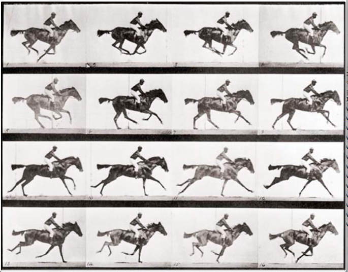
Tomlinson makes his case for using computers for mapping clear in his 1967 movie “Data for Decision.”[6] Made for the Department of Forestry and Rural Development, the film depicts the problem of mapping such a large vast landscape very. In the film a small number people are seen walking through shelves of maps that are presumably areas of the Canadian landscape. The combined voice narration and film present the problem that the number of technicians available to evaluate the maps was limited. Furthermore the content in the maps varied in content and scale, placing a burden on technicians to make correlations by hand. This often required that technicians correlate the maps using criteria based on requested information, essentially creating datasets manually. Tomlinson’s solution was to digitize all existing maps without any scale associated with them. Using a drum scanner each analog map could be rasterized and later referenced to vector-based maps, to accurately identify boundaries and measure areas. As part of the film, a series of separate maps are shown as being overlaid on top of one another, illustrating a technique and graphic representation method that have since become convention.
The notable benefit to using a computational system was that technicians were able to provide Maps to administrators in a much more efficient manner. Numbers that had originally been made by hand count from several different sources could now be associated within a single drawing. The digital format also gave technicians the ability to supplement, replace, and rescale requested data and content in a far more efficient manner. Overall the film presented a method by which data and content, or information in situ could be correlated in such a manner that the administrative decision-making process could be expedited efficiently within the Department of Agriculture. However the data resources were limited, primarily representing census data in the form numbers. The representation of spatial content was limited. Output was also limited, and was seen in the form of vector graphics as a map was generated for further examination. Upon approval, a drawing could be outputted to a large-format flat bed ink pen plotter.
Perhaps the most limiting factor of the Canadian geographic information system was it’s limited client base. As a project that was financially supported by the government for national and provincial purposes, the project goals were specified from the onset. This affected the process of writing the code for computers that was designed to perform within a highly specified process based on a culture of technicians and administrators that was created prior to the software. The software was also designed to address a specific set of problems and outcomes that affected types of data that were seen as beneficial in the process of making maps.
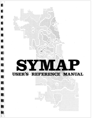
In contrast, the Harvard Laboratory for Computer Graphics and Spatial Analysis was not limited by working with a single client government entity. Founded in 1966[7] by architect Howard Fisher, the lab was more instrumental in experimental cartography and designing hardware/software interfaces that were to be disseminated to interested parties. Of note was the Synergraphic Mapping and Analysis Program (SyMAP) initially coded by Betty Benson with Fisher was at Northwestern University.[8] It that was the predecessor to several other mapping systems designed in the laboratory,[9] and had a similar technical and hierarchical workflow to that of the CGIS. Analog drawings were turned into vector content that was then stored as data. One point interest is that the administrator was replaced by a master programmer who would examine the punch cards prepared by technicians, but the overall hierarchy remained in place.

SYMAP user manual, 1972
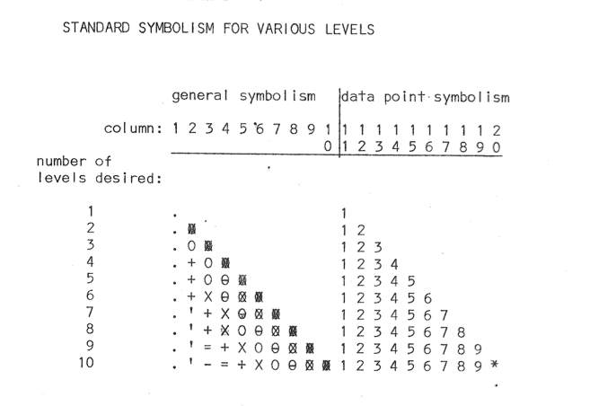
The SyMAP program was capable of producing three basic map types: conformant, proximal, and contour. However, the drawing types appeared to be more or less similar to one another in content they represent and difficult to read compared to the halftone pattern used by McHarg. This was the result of a key output feature built into the system that assumed all potential users of this software would have access to line matrix printers. SyMAP had ability to present the drum from advancing to the next row of text, allowing a line to be overwritten with different characters. The resulting effect was set of patterns and textures that created discernible areas, made through the use of characters from the standard QWERTY keyboard. Areas defined using the over overwritten pattern were discernible, but lacked the level of clarity and detail present in the hand applied halftone patterns used in analog overlay maps. In addition, lines were not as clear as line work outputted from the flatbed plotters used by the CGIS.

Examples of overprint output from the SYMAP manual
The patterns did have the benefit of allowing cartographers to directly locate data in a place. This is a great deal more beneficial as compared to the maps generated by the CGIS, enabled data to be shared across a larger audience given the use of a visual language and not referential system. This attention to represent data spatially carry through a number of projects in the lab, including a film by Alan Schmidt.[10] This represented a breakthrough at the lab as the first instance in which this data was visualized as a film. More importantly it was the first occasion in which GIS content was animated in order to describe change.

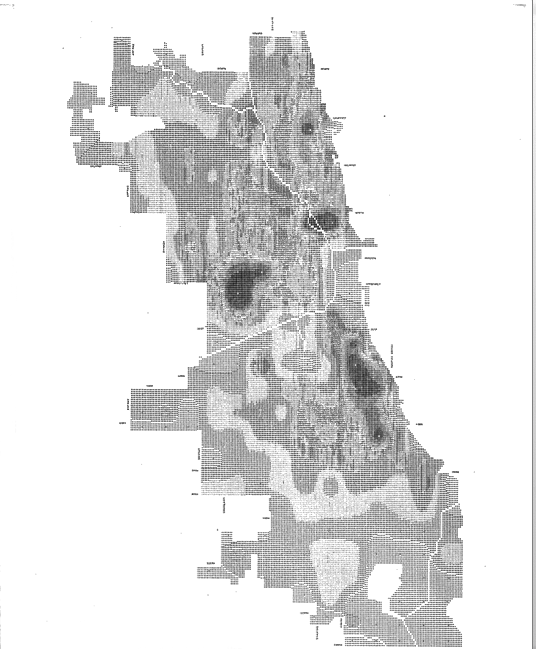
Contour map illustrating the populations of Chicago in 1960. Made with SYMAP.
Both the CGIS and the Harvard laboratory for computer graphics and spatial analysis were instrumental in the production of software and associated conventions of use. The relationship between a photographer, or technician, and the administrator or curator became something of a standardized workflow. It is not uncommon to understand GIS not as something important to design practices, but as a niche skill that ensures job security. Data organized in GIS is also seen as a discrete entity that is not capable of being manipulated for design speculation or projection. Most importantly output from both organizations was not in alignment with standards of representation in landscape architectural practices, nor was it seen as relevant with the postmodern aesthetic that was predominate at that period of time.
The representational and technical limitations experienced in purposing GIS is hinted at the essay by James Corner “The Agency of mapping: Speculation, Critique and Invention,” Corner argues that mapping is not the process of the present what is already evident, but is something that describes in discovers new condition- things that had not been seen prior to that point. Corner argues that:
As a creative practice, mapping precipitates its most productive effects through a finding that is also a founding; its agency lies in neither reproduction nor imposition but rather in uncovering realities previously unseen or unimagined, even across seemingly exhausted grounds. Thus, mapping unfolds potential; it re-makes territory over and over again, each time with new and diverse consequences. Not all maps accomplish this, however; some simply reproduce what is already known. These are more ‘tracings’ than maps, delineating patterns but revealing nothing new. In describing and advocating more open-ended forms of creativity, philosophers Gilles Deleuze and Felix Guattari declare: ‘Make a map not a tracing!’ [11]

James Corner from Take Measure Across the American Landscape.
Within the context of this statement, early modes of GIS would be tracings. Despite innovative uses of data and technology, representation was limited to recording what was already present and presented little if any projective potentials. Taken further, the three key points described by Corner– speculation, critique and invention, valuable in identifying outcomes of the projects. The maps made by McHarg were a form of critique, but relied upon “reading” landscape has a compositional act, with limited numerical sets of information. However data was not spatialized, limiting accessibility to the information represented. The CGIS focused on critique, providing administrators with data referenced to landscapes in order to make decisions. Decisions were made as a separate part of the process, marginalizing technicians and suppressing the agency of data. This had the effect of reinforcing existing hierarchical structures and reiterating normative landscape types. The Harvard laboratory for computer graphics and spatial analysis focused primarily on invention, given the focus on making new software and hardware platforms for dissemination. Well this was a great benefit, the project still relied upon programmers to curate how data was organized and represented, supporting another set of existing hierarchical structures.
The reliance upon existing hierarchal structures of making, analysis and decision-making has continued have the effect of marginalizing data as part of the design process, resulting in normative solutions. This had potentially two negative effects on the use of data to create maps and invent landscapes. The first is that the workflow to make a map has become standardized, limiting its design agency. In fact, Charles Waldheim has argued that the potential of contemporary mapping practices to provide design insight have been exhausted,[12] and argues that projective modes of modeling with respect to time (e.g. animation) provide you trajectories for representation and research. Implicit in his argument is the need to reconcile the compositional approach taken by McHarg versus the data driven approach taken by the CGIS. Added to that would be the need to create platforms that make these resources accessible eliminating the need for the curator/technician dynamic present today.
Given the development of computational systems for the past five decades there are number of factors that make this possible. Landscape data is more readily accessible, making it easier to represent landscapes using digital modes. As an example land surveys are increasingly made as digital models with contours located in three-dimensional space, versus the historic convention of two-dimensional representations. Datasets are more readily available, especially in urban environments. Indeed an individual can compile their own datasets using traditional measuring tools or through the design and creation of electronic devices based on open-source hardware and coding platforms, such as Processing and Arduino. Perhaps the most significant development over the course of the past 50 years has been the advancement in computer drafting software. Object oriented programming environments such as Grasshopper and Dynamo have given designers the ability to use data in order to make decisions directly in the form of parametric design.
There are limitations to applying parametric modeling to landscape process. In the field of architecture, parametric design is applied to the design of discrete objects. Most notably it has been closely associated with the direct fabrication architectural components capable of being assembled to create a greater whole. Landscapes are not discrete, overlapping in type, scale, and systems. Furthermore, computational systems are not capable of processing an entire dataset for a given landscape given the complexity of ecological processes and material relationships. Rather than treat this as a shortcoming of technology or of landscape, this presents an opportunity to leverage the technology and advanced it beyond conventional practices, creating new modes of mapping and new modes for making landscape.
[1] McHarg, Ian L. Design with Nature. Garden City, N.Y: Published for the American Museum of Natural History [by] the Natural History Press, 1969. Page 34.
[2]Coppock, J. Terry, and David W. Rhind. “The History of GIS.” Geographical information Systems: Principles and Applications 1.1 (1991): 21-43.
[3] Ibid.
[4] Ibid.
[5]“Fall 2012.” The 50th Anniversary of GIS. N.p., n.d. Web. 20 June 2014. Electronic
[6] “CGIS History Captioned.” YouTube. YouTube, n.d. Web. 23 June 2014. Electronic
[7]Cf. Nicholas R. Chrisman, Charting the Unknown: How Computer Mapping at Harvard Became GIS (Redlands, CA: ESRI Press, 2006). Electronic.
[8] Nicholas R. Chrisman, History of the Harvard laboratory for computer graphics: a poster exhibit
[9] SYMAP Time-lapse Movie Depicting Growth of Lansing, MI 1850-1965,ESRI 2004 Award.” YouTube. YouTube, n.d. Web. 24 June 2014. Electronic.
[10] Ibid.
[11] Corner, James. “The Agency of Mapping” in The Map Reader: Theories of Mapping Practice and Cartographic Representation. Dodge, Martin, Rob Kitchin, and C R. Perkins. Chichester, West Sussex: Wiley, 2011. Internet resource.
[12] Waldheim, Charles. “Provisional Notes on Landscape Representation and Digital Media” in Landscape Vision Motion: Visual Thinking in Landscape Culture. Girot, Christophe, and Fred Truniger. 2012. Print.